Calculator Prototype: Step-by-Step Guide
Learn how to create a fully functioning calculator prototype with our step-by-step guide. Elevate your skills in advanced UI/UX design.

.jpg)
Welcome to Part 2 of our in-depth series on advanced prototyping. In the first part, How to Build Advanced Prototypes, we explored the fundamental mindset and preparatory thinking a designer needs to embrace before diving into the prototyping process. It's highly recommended to read through the article for a well-rounded grasp of the steps detailed below and to hone your understanding of advanced prototyping.
This understanding is crucial as it lays the groundwork for how you approach your own advanced prototypes. Without simplifying the message too much, it underlines the importance of meticulously thinking about how your product actually operates before you begin prototyping it using ProtoPie or any other tool of your choice.
Now that you’ve read Part 1, open up the starting Pie file below in ProtoPie Studio and follow along.
Overview
- How to prototype a calculator
- Improvement ideas using more advanced features
- Designer-developer collaboration as easy as Pie
How to prototype a calculator
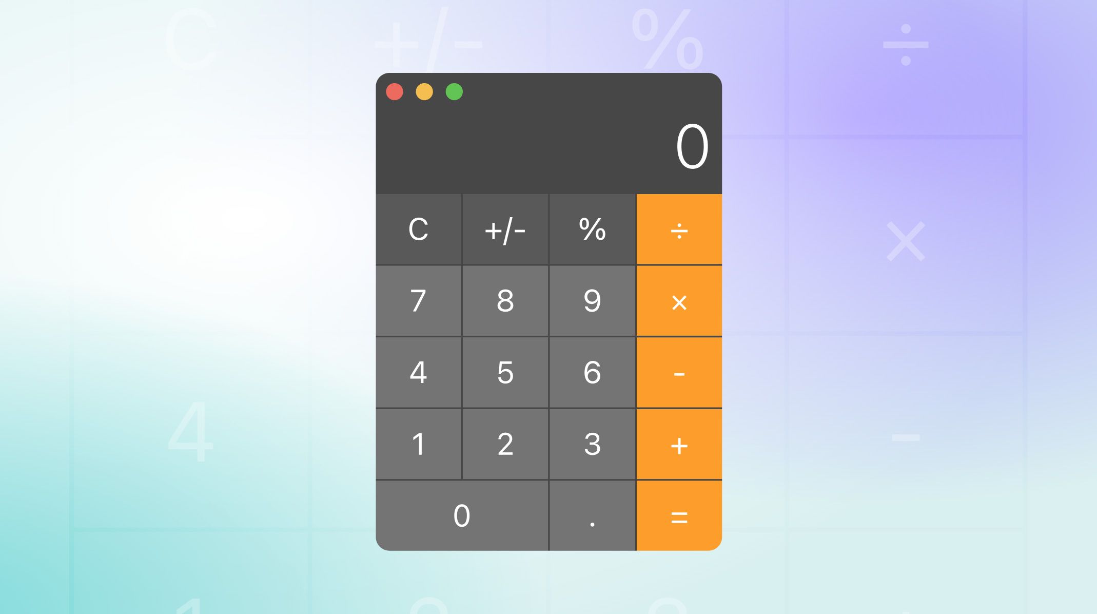
In this tutorial, we'll be showcasing why ProtoPie is a go-to choice for many designers in advanced prototyping projects. We're going to fully utilize ProtoPie’s variables, conditions and components to create a dynamic and interactive user experience mirroring the macOS Calculator app.
Part 1: Use your thinking to guide your build
We’ve broken down our build into four major phases - entering the first number, choosing an operator, entering the second number, and calculating the result to establish a logical workflow. Next, we’ll introduce essential variables A and B, alongside another variable op. We'll also create a digit button component that we can duplicate and efficiently reuse for all 11 possibilities for digits 0 through 9 plus the decimal key.
In this section, you’ll learn how to tactically toggle the variable types between text and number, ensuring accurate decimal number representation and setting a solid groundwork for the complex segments ahead in building the calculator. Let’s see it in action!
Part 2: Complete basic calculation
In this section, we’ll transition between phases based on user input to create and manage our button components for different mathematical operations. The key is to develop the logic necessary for storing and updating variable values.
Additionally, you’ll learn how to handle special cases like the 'equals' operation to display results, and to provide visual feedback by flashing the display when certain actions are performed. Through this process, you’ll be able to build a foundational understanding of managing user interactions and advancing through logical phases in our prototype.
Part 3: Follow on calculations and finishing touches
We’re almost done! In the last part, we’ll refine our calculator to handle follow-on calculations. We’ll integrate our different function buttons and equip each with unique logic.
Through this process, you'll learn how to seamlessly handle different phases and improve the user flow. As a callback to our flow diagram which has been our roadmap throughout this exercise, you’ll see the importance of detailed planning and documentation. By breaking down each step, we are able to save a lot of time setting up the required variables and conditions, and methodically work through the complexities involved in advanced prototyping.
Improvement ideas using more advanced features
In this exercise, we completed a fully functional calculator that performs actual calculations while mirroring a real app — all achieved without writing a single line of code. We have a good foundation now, and there's more we can do. Here are some extra ideas you could add to our prototype to make it even better:
- Add hover and click states to all of the calculator buttons
- Add keyboard input so that you don’t need to point and click
- How about voice input? Why not tell your calculator what to calculate?
- Have the text shrink when there are too many digits to fit in the width of the display
- Upgrade the clear button to a combination AC/C button like the real app
- Use an icon instead of a text label for some of the buttons
- Add memory functions so that you can store the result of a calculation and retrieve it later
- Try adding more function keys or even attempt the scientific calculator layout
All of this is possible and more — this exercise doesn’t even scratch the surface of what is possible with ProtoPie.
Designer-developer collaboration as easy as pie
When you first think critically about how your product works — in minute detail — you’ll find you’ll have an easier time building an advanced prototype. All of the resources you created as a handoff for your developer now become your guide. Remember! You already know your product better than anyone. There’s no one else in a better position to bring it to life.

.jpg)
