How Meta Uses ProtoPie for High-Fidelity Prototyping & User Testing
Discover the top five reasons why Meta designers choose ProtoPie as their go-to tool for high-fidelity prototyping.

Meta, best known as the company behind Facebook and Instagram, entered the AR/VR market back in 2014 as part of its rebranding effort to unify the physical and digital worlds.
High-fidelity prototypes are crucial for designing top-notch digital experiences, especially for a company like Meta. However, Meta's product designers have been struggling with the accessibility gap of their existing prototyping tools until they discovered ProtoPie.
In a webinar titled "How Design Teams Use ProtoPie in Their Workflow," we met Jon Bernbach, a product designer on Meta's Internal Design Tools team. His team is responsible for designing and building tools to assist product and content designers in their work at scale.
You can watch the recording below to gain insights about where prototyping fits into Meta’s design workflow and why their design team chose ProtoPie as the go-to prototyping tool for his team.
Overview
- Why prototyping is important in Meta's product development cycle
- How Meta adopted ProtoPie
- Five reasons why designers at Meta use ProtoPie
- How ProtoPie became the go-to prototyping tool for Meta
Why prototyping is important in Meta's product development cycle
Meta maintains high standards for their products by moving testing and quality assurance to an early point in the development process, a process known as shifting left.
“Everything to the ‘right’ of implementation or going public with your product can be very expensive in terms of development time and engineering,” Jon explains. “The idea is to keep quality to the left and try to pinpoint issues and mistakes before you get to that stage.”
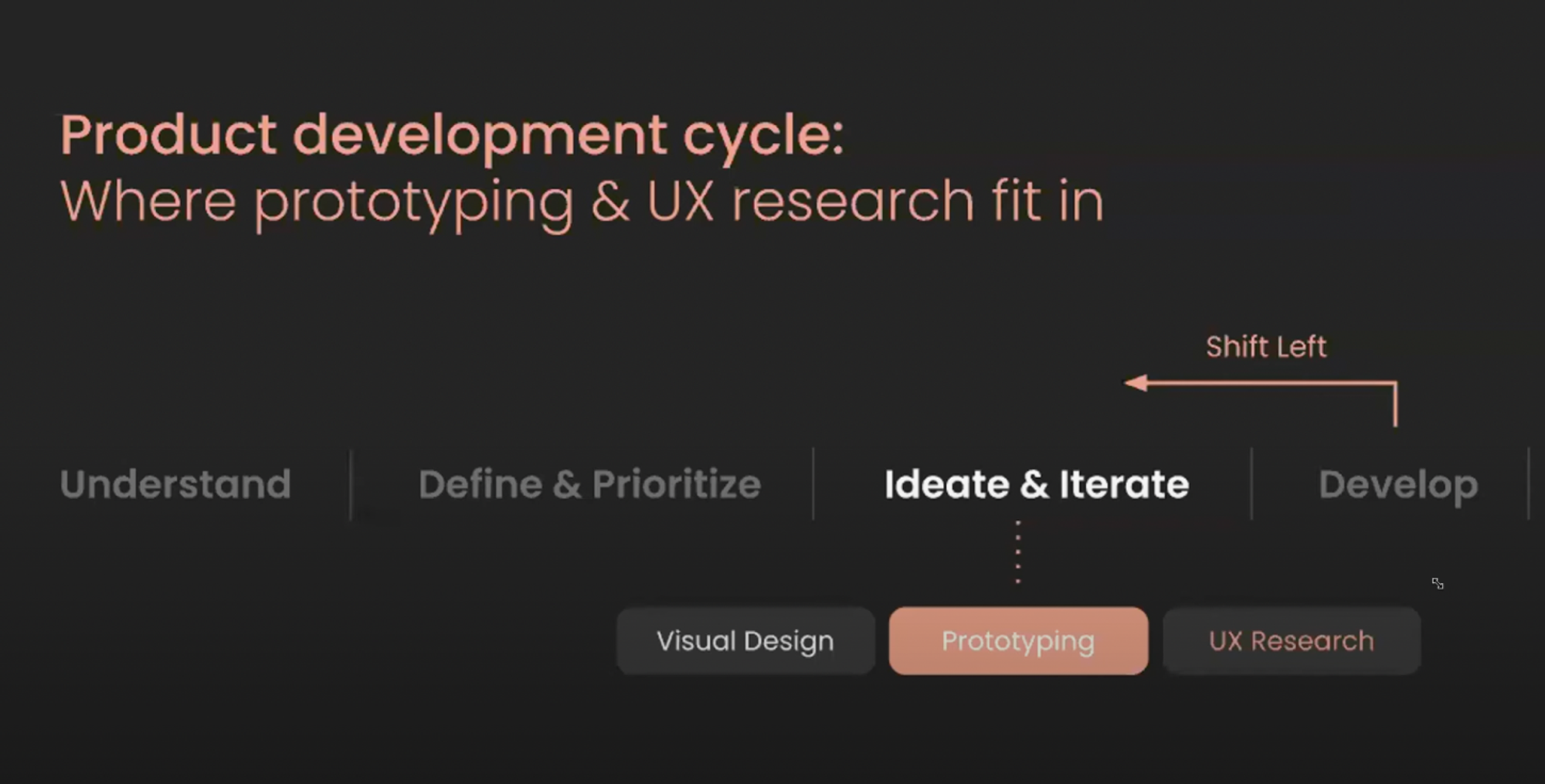
Shifting left is a big part of what Jon’s team is trying to get teams to do more of, meaning things like:
- Adhering to existing design systems and components.
- Using correct colors.
- Following accessibility heuristics.
In practice, this means that teams are being encouraged to engage in extensive prototyping and user research. To accomplish this effectively, they require the appropriate tools. Jon highlights three key areas that demonstrate the significant role that prototyping plays in the development of exceptional products.
1. Prototyping communicates design experiences
Prototyping, especially for innovative digital experiences, increases your team’s velocity by reducing miscommunications that can occur when presenting only static mock-ups.
Reviewing prototypes also helps your team make more informed and strategic decisions, aligning with what is happening so you don’t have to guess or make assumptions.
2. Prototyping unblocks design research
User testing with prototypes dramatically improves usability gains with each round of testing.
With prototypes, a team doesn’t need to rely on A/B experimentation after implementation. This is a very popular practice in technology, especially at big tech companies where it is common to implement a couple of options and then do A/B testing to determine which product is the best fit.
Unfortunately, sometimes, not even A or B is the correct solution to a problem. That’s why keeping things to the left is so important, as it helps mitigate instances of wasting development time on products that are bound to fail.
3. Prototyping improves product quality
By transferring interaction design and decision-making to designers instead of engineers, product quality improves.
The question is: Why haven't designers been including much prototyping in their design process, even though we know it can help improve quality?
How Meta adopted ProtoPie
Meta’s prototyping process before ProtoPie
Meta’s internal research showed that a very small percentage of designers at their company used prototyping tools as part of their workflow.
The reason for that was that Meta designers who needed to create mid-complexity prototypes were frustrated by a significant tool gap.
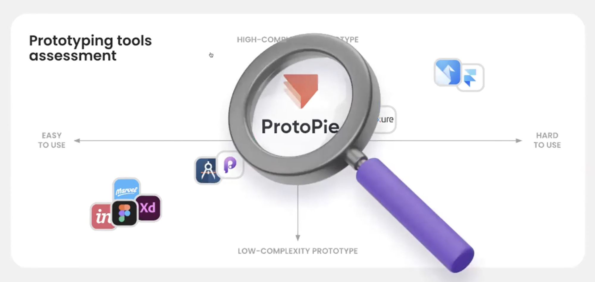
While they do use prototyping tools like Figma, Origami, and Framer at Meta, their designers found that:
- Figma is great for low-complexity prototyping, but its capabilities are limited. There are also security risks when testing participants, using prototypes outside of Meta, and other onboarding obstacles.
- Other tools like Framer and Origami Studio, which they built in-house at Meta, are amazing for high-complexity prototyping. The challenge has been the difficulties in learning how to use the tool, which frustrated and deterred many designers from prototyping.
At Meta, they know from experience that a team that doesn’t incorporate iterative prototyping and research into its product cycle tends to produce lower-quality experiences.
Jon realized that this tool gap was a significant problem they needed to fix. He set two main goals:
- Fill the mid-complexity prototype gap between Figma and Origami.
- Identify a viable prototyping tool to help supercharge secure, iterative design research at Meta.
After assessing thirteen different tools and features, ProtoPie stood out as the tool that was most aligned with the future needs of the most common product designer and UX researcher.
Onboarding Meta's designers to ProtoPie
It takes a lot of work to onboard employees to new software at a large company like Meta because of steps like SSO implementation, creating presentations to promote the tool, ramping up designers with educational materials, and troubleshooting along the way.
Only a small number of Meta designers already have experience with ProtoPie. However, Jon found that during onboarding, some people were learning quite fast and jumped to help others get up to speed.
They worked with researchers separately as they are a completely different user group. The process entailed telling them how to
- Navigate the cloud account;
- Set up a prototype so it is secure;
- Make sure a test participant cannot engage with a prototype after the research session.
Five reasons why designers at Meta use ProtoPie
Jon finds ProtoPie a great tool for anyone who wants to prototype realistic animation interactions and transitions that are outside Figma’s capabilities and can be difficult to understand in tools like Origami Studio or Framer.
He also says it is ideal for prototyping mobile app experiences. Another great future is ProtoPie Connect, which they have been using in the Reality Labs to prototype with external hardware such as Oculus headsets, smartwatches, and other IoT devices.
1. ProtoPie has a low-to-medium learning curve
The mental model of ProtoPie is easy to grasp, and there are a number of free and paid educational resources to help you get the hang of things. This was a huge factor for Jon in choosing ProtoPie.
His team was looking for a design tool that designers could learn relatively quickly and feel excited about using. If they had chosen a tool that had every capability under the sun but wasn’t accessible to designers, they would have just ended up with low adoption, and their problem of bridging the tool gap wouldn’t have been solved.
2. ProtoPie is a no-code, no-variant prototyping tool
Based on Meta’s research, code is often an aspect that makes or breaks a tool in the eyes of designers. For example, tools like Framer have low adoption rates because of the high-intensity coding aspect when doing very complex or mid-level things.
ProtoPie’s integration with Figma was another must-have, as Jon says they wanted a non-variant prototyping tool where designers don’t have to do everything from scratch. According to him, they can accomplish a lot more without having to design a lot of screens.
“It’s kind of like hacking your way to a prototype,” Jon tells us.
3. ProtoPie has secure and growing remote research capabilities
Being able to share prototypes with test participants outside of Meta securely and through web browsers was another important factor.
While native Android and iOS previewer apps are also great, web browsers are a must in the current remote research environment. That’s because test participants don’t really want to download many apps.
Instead, they want to go to a website and start looking at a prototype, so it is much simpler for Meta's UX researchers to use ProtoPie during their testing sessions.
4. ProtoPie is flexible, forgiving, and highly usable
“ProtoPie has found the sweet spot of a powerful interaction design tool that is relatively easy to adopt,” Jon says.
With features like variables, conditions, and custom components, designers can realistically prototype anything beyond what they can do in Figma.
While ProtoPie is nearly as powerful as Origami Studio and Framer, the modern interface follows many familiar design patterns, making the experience more intuitive for designers.
In addition to these four reasons, other must-haves for the team at Meta when choosing ProtoPie were:
- Access to the device’s camera, sensors, and voice UI
- Share and collaborate with XFNs via a cloud account
- Real keyboards and multi-touch gestures
- Real-time interactions across multiple devices
5. ProtoPie fits into the VR team's workflow
Moreover, ProtoPie fits into the workflow of the VR team working on the Oculus headset and hand controllers.

The VR team's designers are exploring how to prototype 2D experiences to test inside headsets. They are also currently working with ProtoPie to develop features to make their headsets more immersive.
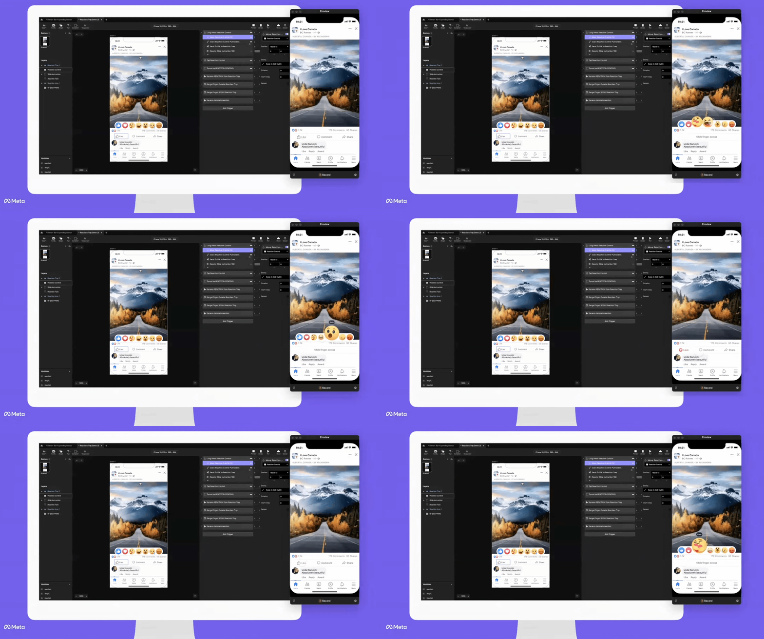
In the prototype shown at minute 18:00 in this video, the designer used variables, formulas, and other sophisticated interactions to make everything happen.
The designer learned ProtoPie in a couple of days, and by the end of the week, he was prototyping quite advanced stuff. This, Jon says, is a testament to the ease of learning ProtoPie, and stood out as a big opportunity for making ProtoPie the go-to tool for the team.
“By using ProtoPie, the team’s production velocity increased since the prototyping can be done without an engineer,” Jon says. “The future looks bright for ProtoPie in the current market, as it found the sweet spot for being a prototyping tool for designers when Figma just won’t do.”
How ProtoPie became the go-to prototyping tool for Meta
Learning a new tool will always be a challenge for most, especially in a fast-paced development environment like Meta.
But, according to Jon, early engagement signals are overwhelmingly positive, and they are seeing results that they never considered before:
- Prototypes are being used in reviews and research, which Jon was surprised to see happen so quickly. Designers are also learning the new tool, so seeing them actually using it quickly and ramping up somehow and then using it in their reviews for new ideas and in research sessions was a really big deal that gave them a lot of positive validation.
- Designers are advocating and evangelizing the tool on their own teams. Designers that Jon was not even aware of on the pilot are using ProtoPie and finding out that it actually fits their team's needs. As Meta is large, you don’t necessarily always know what is going on on everybody’s team, so it was very satisfying to find that ProtoPie is spreading organically even beyond the initial pilot program.
Join Meta and 15,000 other companies that are using ProtoPie for high-fidelity prototyping. Try ProtoPie for free now.
.jpg)
